
Youbloom Referral Hook: Reducing Drop-offs & Acquire New Users
Company
Youbloom
Role
Research
UX design
UI design
Year
2024
Market
USA, B2C
Project Brief
This project has been thoughtfully adapted to respect confidentiality agreements while showcasing my role and design approach. Sensitive business details and proprietary information have been omitted or anonymized to maintain privacy and uphold project integrity.While I can’t share specific impact metrics, this overview focuses on the design process, problem-solving decisions, and key takeaways from the project. As the work evolves, additional insights and refinements will be added to reflect its ongoing development.
Problem
Solution
Fans dropped off at the very beginning of the request journey — often before even selecting an artist.
A search-led experience with real-time feedback and focused action states to guide fans smoothly through their requests.
Referral dismissals dropped 30% Clearer language and placement reduced user confusion and friction.
Click-Through Rate (CTR) rose 80%
40% of clicks led directly to completed artist requests, boosting engagement.
Sharing became intuitive
Streamlined flow increased artist requests and supported organic growth.
The Problem: Deep Dive
With youbloom MVP launch, the product team set out to solve a critical challenge - boosting organic user growth through seamless sharing.
The Referral CTA and Tooltip were designed to encourage users to invite friends and request artists, but early testing revealed a major friction point: users were dismissing tooltips too quickly and overlooking the Share button.
-
Tooltip Fatigue: Users instinctively clicked “X” (close button) to dismiss tooltips without reading, reducing their intended guidance effectiveness.
-
Unclear Value Proposition: Without a strong incentive, users didn’t feel compelled to share events, limiting viral reach.
-
Missed Engagement: The Referral CTA lacked prominence, resulting in fewer clicks and fewer sharings.
To achieve our objective of acquiring new users, we rethought how we guided and motivated them. The product and business teams aligned on:
A redesign of a Referral Experience that :
-
Encouraged fans to refer friends
-
Nudged referred users to take action (like making a first request)
-
Did so in a way that felt contextual, minimal, and emotionally aligned with the fan experience
My Role
As the Product Designer leading the Fan Profile experience, I was responsible for the UX strategy and design of the Referral Hook zone.
This section showcases how the feature evolved across four key versions - from early concept to the final shipped version.
Our team divided ownership by user types (e.g., Artist, Show Creator, Fan). I worked closely with Product Managers, Engineers, and Fellow Designers to ensure a consistent multi-user experience.
In parallel, I collaborated with Marketing, Business, and external partners, working directly with the CEO to align incentives, messaging, and visual impact - translating strategy into a seamless product experience.
Iterations
Baseline - Initial Concept
”Start simple, get it in front of users & focus on the minimal layout”
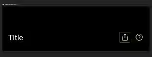
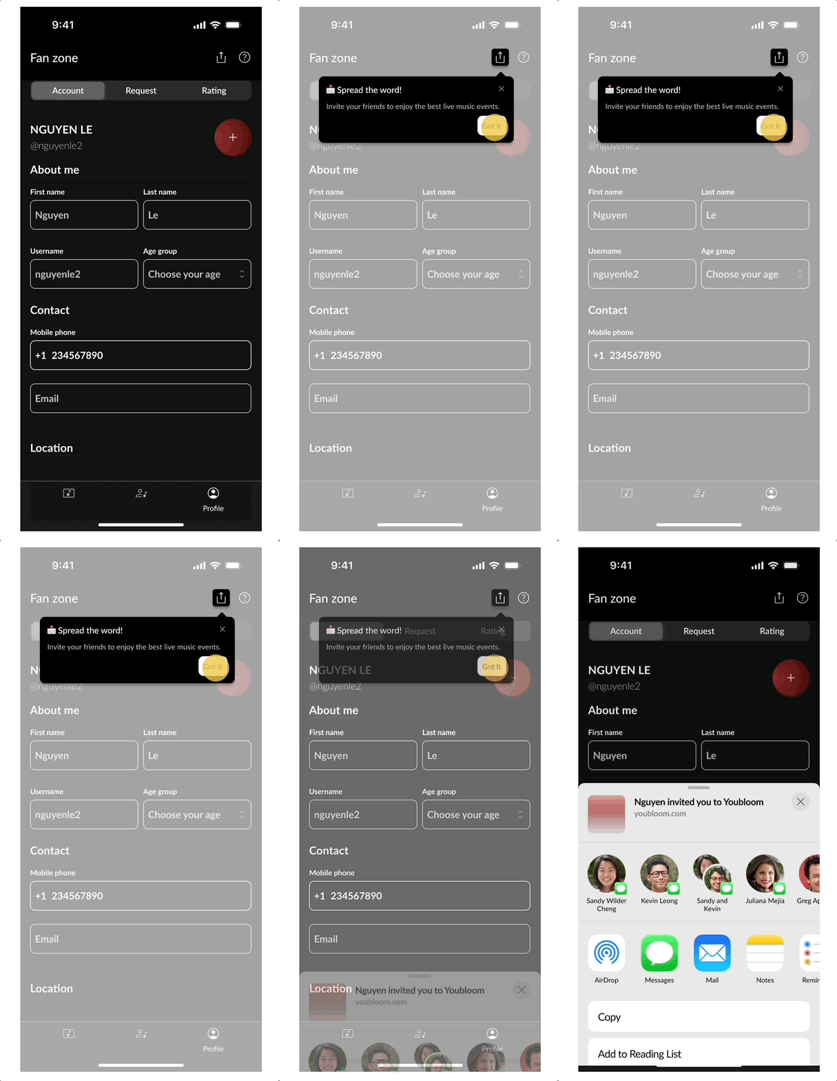
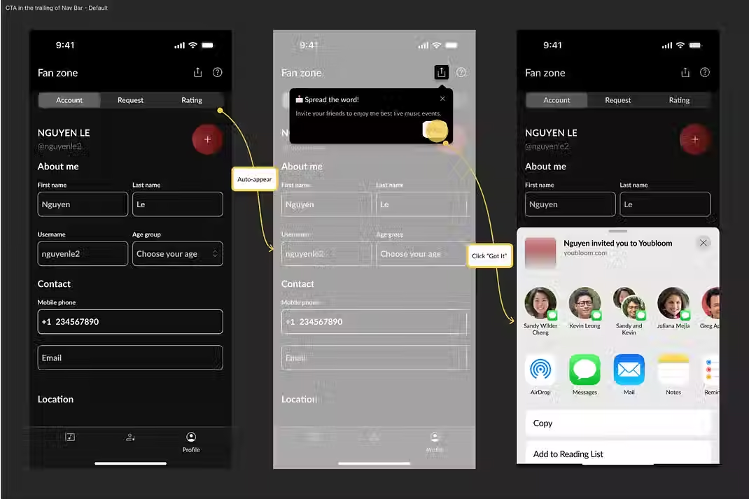
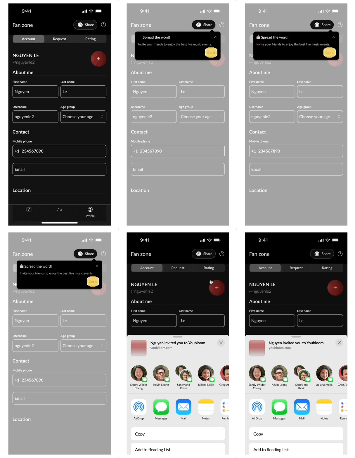
The referral feature started from scratch - adapted from a web platform into a mobile-first experience. I designed the initial Share CTA with a minimalist lens: keeping the layout clean, the button (simply in form of icon) tucked into the trailing nav bar, and supported by a subtle tooltip prompt.
The tooltip included a “Got it” CTA that automatically triggered the iOS Share Sheet. This was a shared decision between the Product team and the Marketing team - the intent was to reduce friction and guide users straight into action.
Even with a friendly tone, the tooltip lacked a hook - users instinctively tapped “X” to close it without reading or recalling what it said.
I referenced competitor apps through desk research, focusing on visibility patterns and lightweight sharing cues.
The assumption? A simple tooltip was enough to guide attention. Fans would notice, understand, and share.
⤷But early results told a different story.
Engagement was low, and in user interviews, most fans couldn’t recall the button - or explain why they should share at all.
▶︎ The concept was clean. But it lacked emotional pull and meaningful context.
▶︎ It was clear the design needed to do more than sit pretty - it needed to 👉🏻motivate action.
.avif)
The ‘Share’ Icon positioned at the Trailing end of the Navigation Bar
Baseline - CTA in the Trailing of Navigation Bar
.avif)
Initial concept: Simple design & Interactions. Visual stack prioritized clarity and clean layout
First Iteration
”Make it Clearer”
After launching the initial version, I conducted 1:1 interviews with early users (fans) and observed their navigation behavior. While the CTA existed, it was consistently overlooked. Most users didn’t notice the icon, and when prompted, couldn’t articulate its purpose.
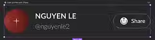
To improve clarity, I redesigned the CTA by adding the word “Share” beside the icon - a simple change aiming to boost visibility and comprehension. I kept its location consistent (top-right, trailing in the nav bar) and retained the same interaction flow to minimize disruption.
▶︎ However, testing revealed little impact - fans still didn’t engage meaningfully. While the label helped a few users recognize the function, motivation remained low. Users weren’t sure why they should share, and the tooltip message lacked emotional pull or contextual drive.
.avif)
Share CTA - Added Text Label for Clarity
Baseline - CTA in the Trailing of Navigation Bar
.avif)
Early redesign of the Share CTA Button - labeled and kept position in the top Navigation Bar
Second Iteration
“Meet Them Where They Look”
Building on insights from earlier tests, I conducted a second round of usability testing and follow-up interviews, this time focusing on natural user behavior - where do fans instinctively look and tap?
I noticed a pattern: users often entered their profile section just to check or update personal details like name, age, or avatar.
This revealed a key behavioral insight: users are drawn to their own identity space. The profile block isn’t just functional - it’s personal and emotionally sticky.
▶︎ Design Response:
We moved the referral CTA directly into the profile block, beside the avatar and display name. This placement gave it more visual priority and felt contextually relevant to music fans who value personal recognition.
⚠️ Emerging Pain Point:
Although visibility improved, interviews surfaced a usability friction point: users were confused and frustrated by the tooltip’s “Got it” button behavior. They expected it to simply dismiss the message - instead, it unexpectedly triggered the share action. Many felt tricked or misled, and some closed the app out of irritation.
Around this time, the Marketing and Business teams aligned on a clear incentive:
“Get 20% OFF when your friends join.”
This gave the referral flow a meaningful hook - one we hadn’t yet communicated in the UI.
This round was driven by empathy and observation - identifying where attention naturally flows, and where trust breaks down. While the CTA placement aligned better with user behavior, the tooltip and incentive still needed work - leading to a more decisive shift in the final iteration.
.avif)
Repositioned CTA within the user profile zone
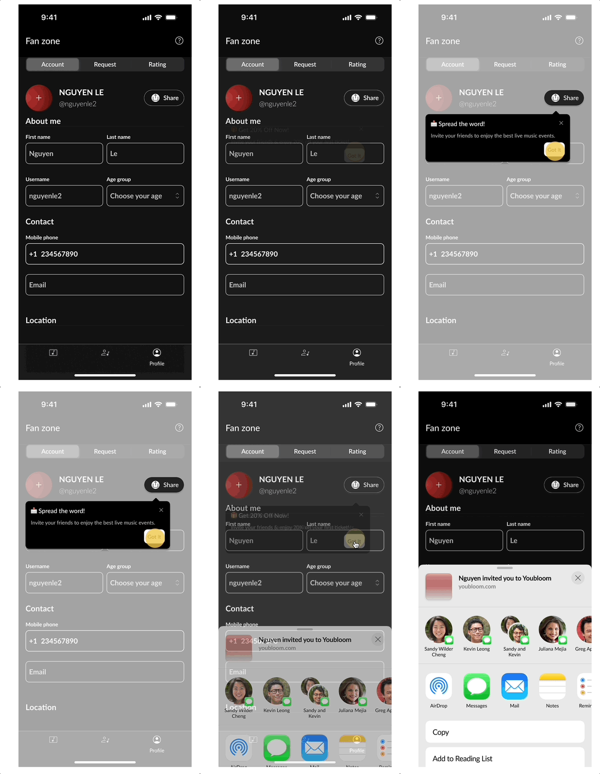
Second Iteration - CTA Button reposition
.avif)
CTA repositioned next to user profile info to match natural attention flow
Third Iteration
”Unlock Rewards Instantly, Solving for Clarity, Motivation & Trust”
Based on feedback loops and team KPIs, we aligned across Product, Marketing, and Business on a clear direction: make the referral reward immediately visible, emotionally engaging, and self-explanatory.
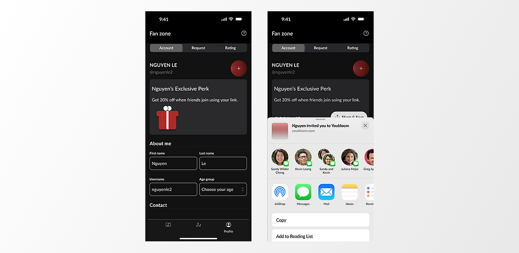
Dedicated Exclusive Zone
We introduced a Dedicated Exclusive Zone directly below the user’s profile—where users naturally focus and feel the strongest sense of ownership.
This zone replaces passive prompts with a clear, celebratory reward surface, designed to drive discovery and conversion.
Users are emotionally connected to their profile block
Animation-led Reward Reveal
The reward is introduced through a lightweight animation sequence:
-
A gift icon subtly animates to attract attention.
-
The motion signals value and anticipation
-
Tapping “Open your reward” reveals the incentive
This animation creates a moment of delight while clearly communicating what the reward is and what action to take next—without instructions or tooltips
Clear Value, Clear Action
The message “Get 20% off when friends join” is surfaced directly in the reward zone, transforming referrals from a passive option into a value-forward incentive.
The CTA is intentionally explicit:
-
“Open your reward” confirms intent
-
Follow-up sharing actions occur only after users understand the benefit
Behavioral Insight Applied
Earlier usability testing showed that users instinctively interact with their profile section.
By anchoring the referral experience there, the reward feels personal, earned, and trustworthy—not promotional.
Outcome
This iteration removes ambiguity, reduces friction, and builds motivation through:
-
Immediate visibility
-
Emotional feedback via animation
-
Clear separation between discovery and action
The result is a referral experience that feels intentional, rewarding, and easy to engage with—even in an MVP.
.avif)
Component Set of the Referral Incentive Zone
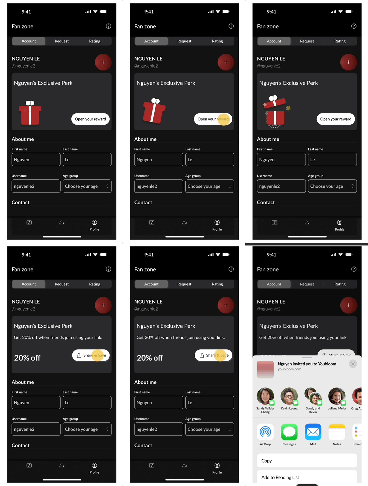
3rd Iteration - Final Referral Incentive Zone
.avif)
Final Zone: The Hook that Drives Action
Key Modules & Reusable Components


Final Takeaways
This project reminded me that design is not just about pixels - it’s about people .
Every iteration taught me something deeper about user instincts, motivation, and emotional cues. From the initial friction with the tooltip to the behavioral insight around the profile section, we moved closer to a solution that felt natural, intuitive, and rewarding.
What made the difference was:
-
Grounding design decisions in real user behavior.
-
Creating space for cross-functional alignment - especially with Marketing and Dev.
-
Iterating not just the UI, but the mental model behind each action.
Although this version was the most engaging by design, what mattered most was that it restored user trust, clarified the value of referrals, and felt fun, personal, and worth sharing.
Please Note: As the project is still in progress, not all designs are available for display or discussion at this time.